There are three main highways that run through Austin. There’s I-35, the largest highway in the area, running the entire length from San Antonio, through Austin, all the way up to Dallas. There’s Route 1 — also known as MoPac because it runs alongside the Missouri-Pacific railway line — which provides access to most of Austin. Finally, there is 183, a smaller road that primarily serves areas in North Austin. It also continues on down south to the airport, but it becomes less of a highway at that point.
My commute to work involves 183, and there are a few billboards dotted along its length. One that popped up recently was quite simple: the word “healthcare” in all caps and a colorful font. A week later, it changed. The billboard looked like it was split into two, breaking the word down the middle. And then finally, another week later, the billboard returned to its normal rectangular shape with a band-aid down the middle. The word “healthcare” had been replaced with the word “humancare”, and a local hospital’s logo was in the bottom right. At last, the mysterious series of ads made sense.
It’s not really the message that grabbed my attention though. Rather, it was the billboard itself that brought back memories of my childhood.
I didn’t grow up in the city. I was born near the city, but I don’t really remember that part of my life. Instead, I remember the English countryside, and the small town we moved to. My grandparents, on the other hand, still lived in the city and we would make regular trips back up there. As a kid, I wasn’t very fond of those journeys. I looked forward to seeing family, sure; but there isn’t much fun in a trip when you still don’t have a firm grasp of time, distance and complicated highway interchanges.
Despite not really understanding the logistics of driving from home to grandparents, there was one thing I did understand: the city was different. It was different from where I lived, and there was one thing in particular that I kept an eye out for because I knew it meant we were close: billboards. They were huge, colorful posters near the road, and there was nothing like them near home. I never really understood why there weren’t, because they were SO COOL. And they were always different! Every time we made the trip, I would look forward to not only seeing them — since I knew it meant we were close — but also seeing what visual randomness was on display this time.
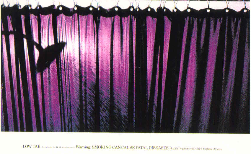
On its own, I think this is a cute story about a random memory — but there’s a twist. British billboards were (are?) rather quirky, especially in the 80s. In particular, I remember being mesmerized by a series of billboards featuring nothing more than silk, the color purple, and a pair of scissors. Sometimes it was a riff on these themes — a different fabric, the color purple, and something sharp. There were no words. Not even a brand name. I think later on I vaguely remember a warning box appearing, but I’m pretty sure that didn’t exist early on — at least, not enough that a young boy would notice.
It built up a mystique in my head about these artistic murals that were as much a part of the city as the large buildings, busy streets and intimidating crowds. This wasn’t about advertising, or bluntly hitting you over the head with slogans and brand names. It was about a puzzle. A puzzle that needed to be solved. What did they mean? What did the silk represent? Why was it always being cut by scissors? Other billboards seemed to have a purpose, but these just seemed to be abstract mind games. Finally, out of frustration, I asked my parents what one of these billboards meant. A momentary pause and “I don’t know” was the reply.
All these years later, with the power of Google, I finally have my answer. These billboards were part of a surreal ad campaign by two cigarette companies popular in the UK, Silk Cut and Benson & Hedges.

As this blog post about the ads explains:
[…] British law prevented cigarette ads from associating cigarettes with status, youth, coolness or sexual attractiveness. So the ad men needed a different route.
A different route indeed.
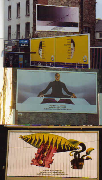
The ads ranged from the simple and straightforward, to the evocative, to the downright bizarre.

On the one hand, it was genius. I had no idea what was going on with these billboards, and the more I tried to figure it out, the more they had a captive audience.

Of course, because I had no idea what they were about, I could never build any brand loyalty or strong association to the product. It quickly became clear why my parents never explained the ads. Then again, I doubt I would have suddenly started smoking if I had found out that this compelling art was peddling cigarettes — but it does demonstrate the power of visual media.
Even though I now know the darker side to this recollection, I don’t let it affect the feelings of childhood wonder and whimsy that float about in those foggy caverns of memory. If I let myself indulge a little bit longer, I find myself sitting in the bedroom of my grandparents’ flat, looking out of the side glass door. It overlooked a grass field in front of their complex, a small side street, and then a building. On the side of that building was a billboard. I would check that billboard every time we visited, and it was almost always different. Sometimes, if I was really lucky, they would be in the middle of changing it while I was there. During those times, I was content to watch them put up a new image, waiting with anticipation for what it would be. I wallow in that memory, wanting to sit there and never move. To linger, to see what surprise was in store.
But then something forces my attention away.
Stay there.
The billboard is half-done.
Please. Just a little longer.
I walk away
and the memory fades.