I’m still playing with the Windows 8 beta – er, sorry, “Consumer Preview†— and exploring its details. However, first impressions are important, and I think I have a few key observations to make.
Last year, I downloaded the developer preview when it became available. I didn’t spend too much time with it, because it was obvious how early of a build it was. Still, the Metro interface was promising, and the few apps that were available showed great promise.
One big complaint about the developer preview, though, was how much it relied on touch. You could use a mouse and a keyboard, sure, but they were second-class citizens. On the one hand, this was good: Microsoft desperately needed a good touch interface, and there was nothing better than Metro. But on the other hand, it was awkward to use on a traditional computer. Considering that this was the next version of Windows, that was a major problem.
Since then, Microsoft has attempted to soothe everyone’s fears with a consistent message – a message that was reiterated by Steven Sinofsky at the Consumer Preview launch event:
Sinofsky’s concern, however, is ensuring developers are on the same page, designing Metro apps that work just as well on touchscreens as they do with a mouse.
"The goal should be that the operating system scales with you," added Sinofsky.
"That’s what we mean by a no-compromise experience."
For the Consumer Preview, they took many steps to help make the Metro interface more intuitive for the keyboard and mouse, so that there were no compromises. But were they successful?
Let me first back up a moment and talk about what I like in Windows 8. The traditional desktop portion is mostly unchanged, so it probably comes as no surprise that most of what I enjoy centers on the Metro-style Start Screen. It is truly exceptional. It’s like a large Windows Phone, with constantly updating information such as weather, recent mail and calendar events. It’s actually tempting to always leave the Start Screen up, just for the quick information overview.
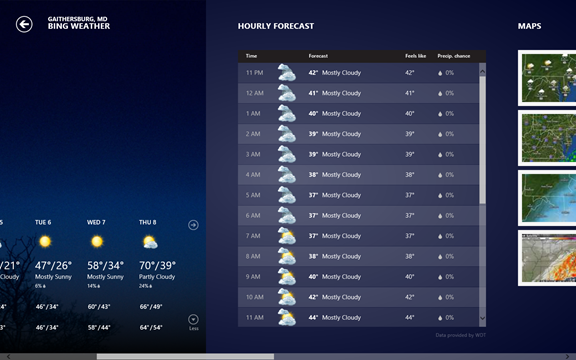
If you do choose to dive into one of the Metro-style apps, though, you’re in for a treat. Weather, for example, gives you full-screen graphics and information that’s easy to understand and absorb. It isn’t busy with extraneous information – unless you choose to view it. You can move from left to right, just like on Windows Phone, allowing you to see more detail: first the extended forecast, then hourly breakdown, then weather maps, then, lastly, historical data.
It’s difficult to convey how visually appealing these apps are. They’re immersive, sleek experiences, rivaling even Apple’s best apps. You may have seen screenshots, but even those don’t really do justice to the presentation. One can only hope that third-party developers will stay true to this design methodology. I know I will when I choose to craft an app for Windows 8.
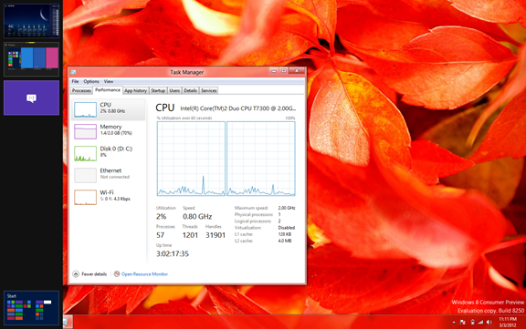
There are a few treats for those who prefer to hang around the traditional Windows desktop. Explorer windows now sport Microsoft’s ribbon UI, which is always a bit jarring at first, but becomes more welcome as you grow familiar with its layout. The Task Manager has undergone several major changes, providing more relevant information about your system, displayed in a way that’s easy to interpret. (Seriously, heat maps are awesome.) There have also been some minor tweaks to the window frame “glass†and buttons.
Perhaps the biggest change, however, is the lack of a Start button. This is where the “no compromises†message begins – and where we start to see whether Microsoft has successfully bridged the world of traditional computing and touch computing.
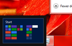
 Moving your mouse to the old Start button location achieves nothing. However, if you keep your mouse moving down into the lower left corner, you reveal a thumbnail of the Start Screen. This is one of several “hot corners†that let you quickly navigate your way around Windows 8 with a mouse and keyboard.
My first instinct when I saw this Start Screen thumbnail was to mouse over it, like when you mouse over a window thumbnail in Windows 7. All this did, though, was make the thumbnail disappear. Instead, you have to click while the mouse is in the corner, and this whisks you back to the Start Screen. You can also press the Windows key on your keyboard, which makes it analogous to the home button on a tablet.
Another hot corner is in the upper left. This one shows a thumbnail of your last app. Clicking there switches you back to it. The previous hot corner taught me that moving your mouse away from the corner achieves nothing – but that rule is broken here. If you move your mouse down along the left edge, it reveals all of your open apps, allowing you to switch to one by clicking its thumbnail. (I later realized that you can use this trick in the lower left, too, but I hadn’t tried it due to the previous behavior.)
As you flip in and out of the Start Screen, and between open applications, you quickly realize that the desktop has been downgraded to app status. Launching an application used to be something that happened on your desktop – but now you’re forced to return to the Start Screen. It’s even more surreal when you double-click an image file on your desktop and, instead of the image opening on your desktop, the entire desktop gets pushed aside and replaced by an isolated, full-screen Photo app.
This can all be disorienting for new users of Windows 8, but it’s made worse if you don’t have the right input devices. I started using Windows 8 on my old Dell laptop, with a standard PC trackpad. It was never a great input device with previous versions of Windows, but it’s even more dreadful in Windows 8. Metro apps require a lot of scrolling from left to right, which means you’re constantly having to grab scrollbars and drag – a painful process made worse by the tiny trackpad.
Using an actual mouse is better. The scroll wheel gives you a quick way to traverse the length of a Metro app’s display. Unfortunately, the scroll wheel becomes useless for anything else. For an example of this, try to scroll through the hourly forecast inside the Weather app using your scroll wheel. You can’t – it just continues to scroll the entire app’s display.

If you use your scroll wheel, which scrollbar moves?
So what does all this mean? Personally, I don’t think Microsoft succeeded in making Windows 8 accessible to the traditional keyboard and mouse. Certainly, the hot corner shortcuts are useful once you learn them and get used to them. But it’s a steep learning curve to get there, and it’s much less elegant than touch.
On top of that, you have to have the right devices to make the most of the interface. Your laptop might have enough horsepower to run the OS, but that gimpy trackpad is going to be the source of many headaches if you spend a lot of time in Metro apps.
With the right hardware, and an open mindset, Windows 8 is promising. My first impressions are mixed, but I hope that as I play with it more, I will grow more accustomed to its new interface – as long as I stay far away from my Dell’s trackpad. After all, there is a great deal to like about Windows 8: Metro design, Xbox integration, native SkyDrive access, reimagined tools for powerusers – the list goes on. But it doesn’t mean much if you have to fight your way through the interface.
