 Question: What is a review?
Answer: A thorough, unbiased evaluation with the intention of determining a final critique.
It may not be a proper dictionary definition, but this is what I expect when I read technology reviews. Most of the time, I am satisfied. But with the release of iOS 5, I was consistently disappointed. Gone was the thoroughness. Gone was the proper critique. They read more like summaries of the features listed in an Apple press release. There were some details, of course, but there was also a lot missing.
This is my attempt to fill in some of the gaps. I’m not going to attempt to do a full review. But I want to look at iOS 5 with fresh eyes, explore some of the details overlooked in other reviews, and briefly sum up how it compares to other mobile operating systems available today.
So, lets begin.
Overview
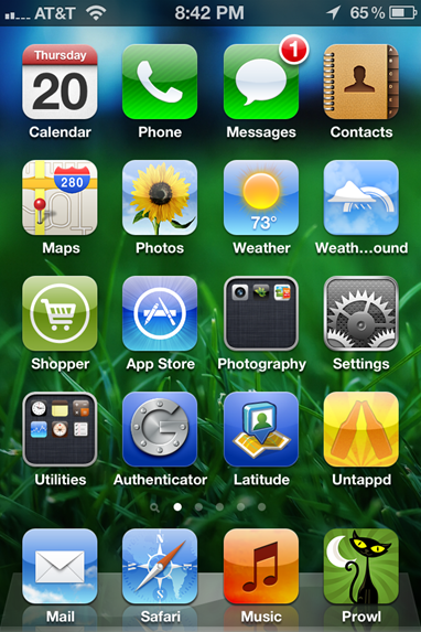 It should be pretty clear to anyone who has paid attention to iOS 5 that there is no dramatic interface overhaul in this update. Most reviews briefly mention that this is a mark in the “negative†column, but don’t dwell on it. I think it deserves more attention than that, though.
iOS started off very simply. Actually, to be pedantic, iPhone OS was very simple. The grid of icons made perfect sense. It was clear, colorful, and concise – things that were very difficult to find in any other phone at the time.
Since then, the OS has evolved into a monster, strained to the gills with apps, folders and bookmarks. There is some freedom here: due to the flexibility that folders and multiple pages offer, you can pretty much come up with any organizational scheme you want. But it’s hard to make anything particularly obvious.
For example, the first page of my phone, in the screenshot above, shows my essential apps. These are things I use frequently, and like to have quick access to – they’re one or two home button presses away.
After that, I have pages dedicated to games, then internet, then music/video/media and then, finally, food/business. And yet, I find myself mindlessly flipping between pages as I try to orient myself. There is no obvious title or header to each page to clue me in to where I am. And there is no way to know if swiping left or right will take me in the direction I want to go unless I stop and think – which may not always be a luxury I possess if I’m trying to grab a piece of information as quickly as possible.
The multitasking tray helps a bit, by keeping most-recently-accessed apps in front. But there are times when an app isn’t as “recently accessed†as I thought, or my “double press†of the phone’s home button doesn’t quite register and I end up being whisked away to the Search iPhone screen.
Part of the problem, perhaps, is that I’m not organizing my phone properly. However, I believe the bigger issue is that there needs to be a more immersive and logical way to organize apps and information. Some information is very important to me – email, Twitter, weather – and should be surfaced to the top in a quick, discoverable manner. Less important items, like Chipotle’s online ordering app, or the Dropbox app, should be easy to access but out of the way. Currently, everything has an equal footprint, and it’s overwhelming.

without having to go to the call log.
Notification Center
As dire as all this sounds, there is one place where Apple truly “got itâ€. Nevermind that it took four years: it’s here, and it’s a godsend.
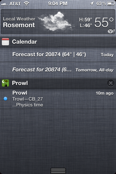
GPS-located weather is surfaced on the top, just like I was wishing for earlier. (It’s certainly a lot more helpful than the flat, boring “sunny and 73†icon that graces the home screen.) Then, all notifications are listed in a per-app, compact list that makes catching up on what you’ve missed a breeze.
Even better, all of this (except weather) is available right on the lock screen, too.
Something most reviews don’t even mention is that you can add new mail alerts to Notification Center. Instead of having to unlock your phone and going into the Mail app to find out what you received, you can just look in the notification center.
In a very un-Apple move, notifications are extremely customizable. For any app with notifications, you can turn on or turn off any of the following: banners when the notification is received, an entry in the notification center, an entry on the lock screen, badges and old-style message alerts.
Music
The “iPod†app was renamed to the “Music†app in iOS 5, helping to make its function a little more clear and focused. (There is a new “Videos†app for videos.) One thing I’ve hardly seen mentioned, though, is that this app is completely redesigned on the iPad. Behold:
Before 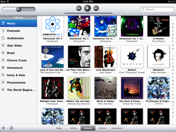
After 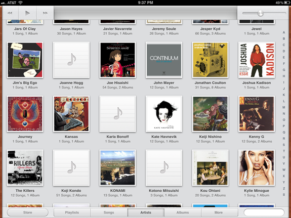
With less of an iTunes look, the iPad’s Music app now looks more like a wood paneled jukebox (sort of). It is definitely cleaner, with a focus on your content rather than the controls. It would have been better if Apple had put this creative energy toward refining their iTunes software, but this is still a welcome change. I’m surprised it wasn’t mentioned in reviews more, but Music probably isn’t the iPad’s primary purpose for most people.
Not that I really blame anyone for that. When Apple introduced the iPod, music was the focus. Since then, that focus has progressively faded. The cynical part of me thinks this is because Apple doesn’t need the music industry anymore – their bread is now buttered by their own App Store.
It’s a shame, though, because there is so much more they could do with their Music app. The new interface is a big improvement, no question, but it’s very sparse. I really wish that Apple would “borrow†some of the ideas from Microsoft’s Zune. The full screen, immersive experience you get when you play music in the Zune software, or on a Zune device, is nothing short of spectacular. It reminds me of iTunes’ recent LP feature, but done with the type of artistic flair that Apple is usually known for.
I’ve always held out hope that Apple would evolve their Music app into something worthy of their ecosystem, but it hasn’t happened. If this is the extent of their redesign ideas, then one of the more compelling parts of iOS has become as stale as the home screen.
Wi-Fi Sync
Leaving the best until last. Unfortunately, in this case, it is the “best†at being broken, not the best at being useful. I wish it was useful. I have to say, I was looking forward to Wi-fi sync quite a bit. Zune has had this ability for a while, and it has always confused me as to why Apple continued to rely on cables – especially with how much emphasis Apple puts on simplicity. Cables are anything but simple. Especially Apple’s 30-pin dock connector. But I digress…
After installing iTunes 10.5, iOS 5, and enabling Wi-fi sync, it quickly became clear that iTunes had to be open all the time. I tried closing iTunes, but five minutes later it popped back open. At first I thought that this was because my iPad was plugged in (Wi-fi sync automatically starts when a device starts charging). But even when all devices are unplugged, iTunes keeps popping back open.
Why is this bad? iTunes is bulky, consistently taking over 130MB of RAM. That’s not a program I want to keep open. That RAM could be better used for games, programming, image manipulation, or any other type of program that attempts to utilize as much RAM as it can (and for a good reason, unlike iTunes).
Now, some of you may argue that this is a necessity. It is syncing with your computer’s library, after all. Doesn’t that require iTunes? Not necessarily. The syncing portion could easily be a separate service that runs in the background, connecting to devices as necessary, and updating the required files. If iTunes is opened, it connects to that service to see the current status, and reflects that information right in the iTunes window. It would be lighter weight, cleaner, and more stable.
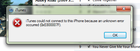
Oh, right – stability. So, all of this is annoying, but I might be able to overlook it if it worked. But it doesn’t. In fact, the only times I’ve been able to get Wi-fi sync to work is when I manually start it, and carefully watch the process. Whenever it tries to automatically sync when I charge my iPhone, I get this:
Even manual sync has failed a couple of times, with this error:
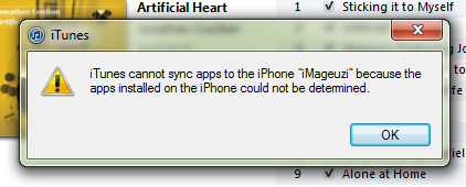
For variation, this error uses a different alert icon!
You know, it’s a good thing that Apple’s stuff usually works well together. Because their errors are USELESS. At least I was able to fix that second error (for now?) by doing a normal, tethered sync.
I really want to like Wi-fi sync. I’ve waited for it for so long, I want to find out what’s going on and get it working. But Apple’s errors are useless, and I’m tired of fighting with it blindly. I may have to give it up and hope that it’s improved in a future update.
Wrap up

Like I said at the start, I didn’t want to attempt a full review. Many other outlets did a decent job in that regard. There were just a few details that I didn’t agree with, and I’ve outlined them here.
Without a doubt, iOS 5 is the best version of iOS yet. But when compared to other platforms, especially Windows Phone, it’s playing catch up more than introducing anything particularly innovative. In fact, the most innovative feature – Siri – inexplicably requires the iPhone 4S.
Android has a great deal of features, but borrows a lot of user interface ideas from iOS. I haven’t seen enough of the next version, Ice Cream Sandwich, to know whether there are any attempts to differentiate itself in that regard. But speaking from what I do know, it suffers from the same “grid of icons†pitfall. There are interactive widgets, which helps expose some data to the top; but, from what I’ve seen, it’s not enough to raise usability to the next level. It’s great that Android is much more adventurous than iOS when it comes to core features – it’s just too bad that the interface suffers.
Then there’s Windows Phone, which truly does have a unique interface. Icons give way to colorful, interactive Metro tiles, and tasks are split up into distinct “hubsâ€. Given my complaints earlier in this post, it seems the most likely to appeal to me.
Is it better than iOS? Well, nothing is perfect. I like iOS a lot, but its flaws have become painfully obvious to me because I use it on a daily basis. Windows Phone looks attractive, but it’s hard to truly know its advantages and flaws until it undergoes the same stress test.
Ultimately, iOS 5 (minus Siri) has some nice evolutionary improvements, but it doesn’t push the bar. No OS can meet every need. You have to choose the option that works best for you. With three primary mobile operating systems now in play, I have to wonder whether iOS still works for me.
Even after the iOS 5 update, I’m starting to think it doesn’t. I’m not sure if I’m ready to make the leap to another platform just yet — but iOS isn’t holding as much sway over me as it once did.
[…] few days ago, I posted my own thoughts and experiences with iOS 5. At the end of the article, I conclude that Windows Phone 7 would probably appeal to me, because it […]